Branding

The Theory of Colour: Improving Brand Association with Colours

By April 29, 2022 January 19th, 2023 No Comments

Did you know that colour can dramatically affect moods, feelings, and emotions? Well-known novelists, artists, and directors regard colour as an essential tool in storytelling, as it has the power to instantly set a tone and mood.

Think of the different houses in Harry Potter, and how the colours tie in to the supposed personalities of each. The colour of passionate bravery, red, for Gryffindor. Green, associated with cunning wits, for Slytherin. The bright happy colour of yellow, linked to loyalty for Hufflepuff, and the calm stability of blue for Ravenclaw’s smarts.

In fact, in the movie series, the colour spectrum used for each film delineates the growth and maturity of Harry himself. 

https://towardsdatascience.com/exploring-chromatic-storytelling-with-r-part-1-8e9ddf8d4187

He begins as an optimistic young boy, full of hope for a better future. This is denoted by brighter, happier, and warmer colours. By the end of the series, the colour spectrum is dark and gloomy, tracing the trials and tribulations that he has survived through. The colour palette matures, even as he does, growing colder and darker to reflect the dangers that he has faced.

As such, colour is a deliberate stylistic choice for many filmmakers, novelists, and artists. Well, did you know that the same applies for brands?

Colours Used by F&B Brands

Have you had your lunch, or dinner yet? No? Well, neither have we. We’re absolutely starving, so let’s make ourselves even hungrier by looking at some well-known food chains and the colours that they use to influence the perception of their consumers.

Let’s think of some fast-food chains. What colours come to your mind when thinking of McDonald’s, Burger King, Pizza Hut, and KFC?

Lo and behold! Their colours are all energetic and bright, with red being a thread of commonality between all four brands. That’s because red is traditionally seen as an energetic colour that easily attracts the eye.

According to research done by Colour Communications, people make a subconscious judgement about an environment or product within 90 seconds of first seeing it, and between 62% and 90% of that assessment is based on colour alone.

To a large extent, colour controls the perception of consumers regarding certain products and services. Even when a photograph is in black and white, consumers are able to state the colour that they think the product should be in.

Take this Starbucks cup, for example. By now, we would’ve associated the green colour with Starbucks, so even if the cup with the brand had been presented to us in black and white, we would’ve been able to immediately think of the brand’s signature colour.  

Don’t believe us? Give it a try! Ask your friends what colours they think brands in the medical industry usually use. We guarantee that their answers will be blue, or green. On one hand, blue is usually associated with calmness, tranquillity, and serenity. On the other, green is usually symbolic of healing and wellness. This is why medical companies usually use either of the two, or both together.

Now that we’ve established the linkage between brands and signature colours to help consumers better recognise and remember them, how does a brand choose a colour palette for themselves?

Choosing the Right Colours for Your Brand

The first and most important question to ask would be: “Who is my target audience?”

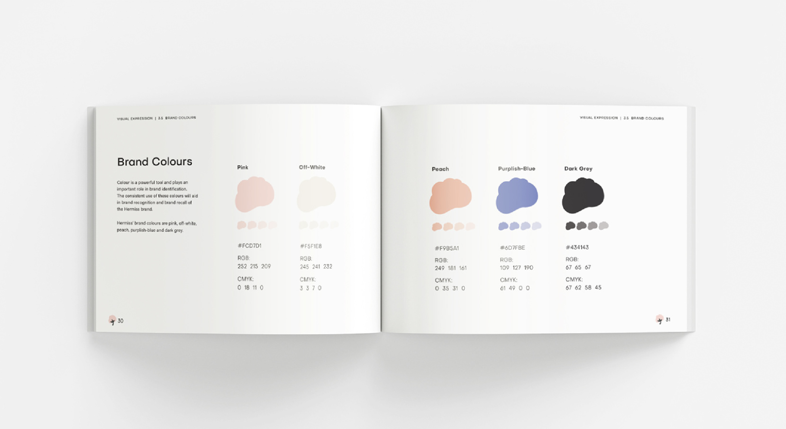
What are their demographics? Their age, gender, likes, dislikes, aspirations, and personality types?

Like with anything else, colour preferences can be largely attributed to different groups. For example, younger children are usually more attracted to bright, solid blocks and highly-contrasting colours. As we move up the age spectrum, they are increasingly exposed to the world around them, resulting in older teenagers appreciating various other hues, such as pastels.

Gender might also play a part in preferences for colour, although that concept is growing increasingly abstract as humanity evolves. Gone are the days where blue was for boys, and pink was for girls. We’re embracing a diverse range of colours for different products for all genders now.

Another question to consider would be the feelings that you wish to invoke in your consumers. That would mean that the brand must consider their purpose, and their goal. Is it to inspire consumers to spend more time in the great outdoors, exploring the wilderness? Or is it to encourage consumers to kick back and relax in the comfort of their home? In this way, colour would depend heavily on the purpose and personality of the brand, alongside the mood and the emotions that the brand wishes their consumers to feel.

Colour Associations

There are many different connotations to colour, and depending on the situation, can vary in meanings quite a fair bit. Red, for example, can be worn for auspicious occasions in Asian countries. Yet at the same time, red can also indicate mistakes, like a red pen crossing out our mistakes on a math paper, or stocks… falling. Hence why the term: “In the red”.

To help you start thinking about the different connotations, here are some examples of colour and how they are used in brands to shape consumer perceptions.

  1. Black

For many brands today, black is commonly used in logos, and as part of colour palettes. The colour conveys strength, formality, and dominance, and is often seen as luxurious and stylish.

Black and gold was paired in Fiore Dorato’s rebranding project to project an aura of grandeur and magnificence. A deep shade of maroon was chosen to further accentuate the exotic, elegant, royal, and exquisite feel of the brand.

View project here: https://etereomedia.com/fiore-dorato/

2. Blue

Blue conveys stability, reliability, and professionalism of the highest order.

Blue is Moby Dick’s signature colour, and is especially fitting for them when considering their unparalleled status as established and respected ship chandlers in Singapore. To reflect the dynamism and vibrancy of their work culture, we adjusted it to a brighter shade of blue.

View project here: https://etereomedia.com/moby-dick/

3. Pink

Often seen as a colour associated with all things feminine, pink is usually associated with softness, sweetness, and love.

Pink was chosen to accentuate the soft comfort of Hermiss’s product. Paired with the motif of the cotton puff, the selected colours for Hermiss resounds with her vision – to provide a seamless, sanitary panty that allows women to move freely with all-day comfort.

View project here: https://www.behance.net/gallery/133783583/Hermiss-Rebranding

4. Brown

Brown is usually associated with the personality of being down-to-earth and confident. It is also viewed as a colour that represents simplicity and naturalness in the recent years.

Known for their elegant, timeless and luxurious handbags and shoes, brown was kept in ode to her beliefs in creating value through stylish products with good quality. Secondary colours were also added to keep their colour palette visually vibrant and stimulating.

View project here: https://etereomedia.com/everbest/ 

5. Yellow

As one of the primary colours, yellow symbolises happiness and optimism, and inspires creativity.

Primary colours, including yellow, were chosen for Playpoint, an award-winning playground and landscaping consultancy as part of their brand colour palette. The endless possibilities that result from mixing all three differently mimics Playpoint’s vision of building unique and atypical playgrounds for communities worldwide.

View project here: https://etereomedia.com/playpoint/

Conclusion

We hope that this article has provided some insight as to how colour affects the perception of consumers on your brand, and the importance of choosing right colours.

Are you looking to rebrand, but are at a loss on how to start? Come chat with us! We’d love to discuss the possibilities for your brand, and would be more than happy to conduct a complimentary, no-obligations audit for your brand.