Branding

Design Principles to Guide Your Brand’s Visual Identity

By May 12, 2022 January 19th, 2023 No Comments

Oftentimes, verbal messaging strategies are overlooked in favour of more eye-catching visual designs. It’s little wonder, considering that humans are visual creatures and respond better to pictures and diagrams as opposed to a chunk of words.

Although brands are paying more attention to their visuals, however, some times, these designs can sometimes come off as slightly awkward, or mildly uncomfortable to look at. MIT neuroscientists have found that the brain can identify images seen in just 13 milliseconds – that’s about 30 times faster than the blink of an eye.

Humans are perceptive creatures. The brain is capable of capturing minute imperfections that make us uncomfortable, all without us being able to pinpoint the source of discomfort. Spacing that’s too wide between certain letters, or an angle that’s not supposed to be there – the brain registers all these. This means that if something is even minutely wrong, people will be able to sense it.

In today’s article, we’ll be going through some design theories that help guide the aesthetics of brand collaterals. Outdated designs are not necessarily limited to websites – and can be seen across a wide range of physical collateral. Like websites, this can be particularly disadvantageous to brands, as these collaterals are usually the first exposure that consumers have to a brand.

First impressions are always important, y’know?

This is where design-theory comes into play. Design-theory is a system of ideas that explains how, or why, designs work. Designers must be able to know how everything they put on a page communicates, influences, directs, invites, entices, and excites an audience.

The answer to all these can be found in design theory. Let’s start by understanding some of the design theories available to us.  

White Space

First up, let’s talk about white space. White space, also known as “negative space”, is empty space around the content and functional elements of a page. We’ve heard horror stories of people asking: “The page looks so empty – can you fill it up with more information?”

Despite being seen as “empty”, or “passive”, white space is actually purposeful and active in helping designs on a collateral breathe. The amount of text and functional elements that users see at once is reduced, helping consumers absorb information better. Let’s take a look at this example.

There’s a clear difference between the two. The left seems somewhat harried, and busy, with no room for breathability, while the right is more comfortable to look at. Designs that use white space look more elegant as opposed to those without.

The Golden Ratio

The golden ratio is a mathematical ratio that is commonly found in nature. Mathematicians have found that many things in nature are bound by the laws of mathematics, and one of which, is the golden ratio.

There are many natural phenomena that are bound by this rule – such as a chameleon’s tail, seashells, ocean waves, flower heads, snail shells, whirlpools, pine cones, sunflower heads, spider webs, and even hurricanes.

The list never ends.

This concept has been around since ancient times, used by great artists in the ancient Greek and neo-classical period to determine pleasing dimensional relationships to help their designs feel proportionate.  

Here’s a look at how the golden ratio is used in Mona Lisa – one of the greatest artworks to ever exist. Today, many designers use the golden ratio to help their designs look proportionate and pleasing to the eye.

Big, Medium, Small

Contrast and variety are important to interesting designs. One of the ways to have a visually-stimulating design is by playing with proportions. This is an extremely common theory used by many artists around the world. To illustrate this idea, let’s take a look at the characters in SpongeBob SquarePants. 

From this picture, we can see that the sizes of the characters come in varying sizes – big, medium and small. This keeps the contrast between each high, keeping the entire show interesting and dynamic.

As compared to having a design that has similar sized elements and shapes all across the board, big, medium, small helps designers to structure their designs in a visually-stimulating and aesthetically-pleasing manner.

Eight Design Principles

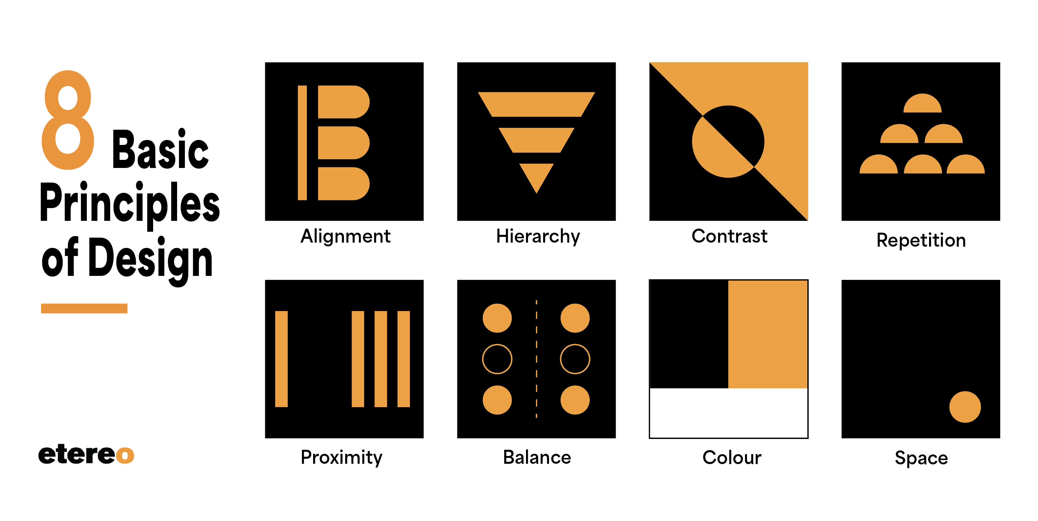
Eight basic principles of design exist to help designers create amazing work – you might find that some of the above theories overlap with those below. Of course, there are many differing opinions on the eight, but these are the basics that should be understood by designers in order to create amazing work.

  • Alignment

Creating a sharp, ordered appearance for elements to connect with each other.

  • Hierarchy

Ordering elements in terms of big, medium, and small to give extra visual weight to the most important message.

  • Contrast

Drawing out important elements of design to add emphasis. For example, black and white, thick and thin, modern and traditional.

  • Repetition

Tying design and overall look together, which helps people remember brands and important information better. Consistent fonts, colours, and brand imagery fall under this category.

  • Proximity

Space between elements, or group of elements to create a relationship between the designs.

  • Balance

Helping viewers look through content in a way that aids comprehension – balance can be achieved symmetrically, while asymmetrical balance uses contrast to even out the flow of the design.

  • Colour

Colour theory helps connect your brand to users on an emotional and subconscious level. For our article on colour theory, please click here.

  • Space

The activeness of the “passive” white space, which helps create space and breathability to highlight important information.

Conclusion

In a podcast, designer Megan Otto mentions that “Great marketing with poor design is poor marketing”. We couldn’t agree more, because designs are the windows to your brand’s soul, and offer. Which of the above design theories and principles are your favourite?

Is your brand looking to revamp their visual identity? Come talk to us! We’d love to strategise on how we can help.