“We cannot become what we want by
remaining what we are.”
Max De Pree
“We cannot become what we want by
remaining what we are.”
Max De Pree
Our Purpose
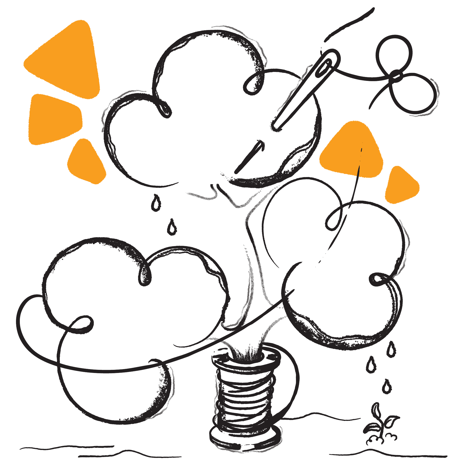
There is no denying that we face changes constantly and, here at Etereo, we believe – either we swim using the currents of change to propel our progress, or we get caught and sink under its weight. Amongst the two, there seems to be only one obvious choice. However, brands often have difficulty fielding change in their environment, leaving them to sink in the weight of it.
That is where we come in. By adopting these attitudes, we help your brand devise proactive and reflexive strategies, be it branding or digital marketing, to flow with change and grow far into the future.
We amplify your brand using proven branding and marketing strategies that we believe in.
We close the gap between your brand and perfection as much as we can, and never rest until we do.
We stay with your brand to oversee her progress, because seeing brands grow is our greatest pride.
We work forthrightly and transparently, and are answerable to both your brand and ourselves.
We immerse ourselves in your brand to tailor specific strategies that work specifically for her.
Connecting the dots between brand values and identity design.
The supplying of necessities for shipping vessels and their crew is a job that requires dedication, passion, and most importantly, responsibility. Moby Dick Supplies, an established ship chandler in Singapore, have stringently kept to these values over the past three decades and are renowned for their professionalism in the maritime industry.
Working with Moby Dick Supplies to redefine her brand assets was an inspiring process, because the brand’s philosophy was inspired by Herman Melville’s Moby-Dick; or, The Whale, one of the world’s greatest literary classics. The founder of Moby Dick Supplies, Mr. Michael Teo, drew immense strength from the lessons of the novel and instilled these values in his business practices.
After leaving their brand assets untouched for the past thirty years, it was time for their visual and verbal brand assets to reflect the meaningful values entrenched in Moby Dick Supplies’ culture.
For us, it was instinctive that the humpback whale – a motif in the novel – would be Moby Dick Supplies’ new logomark. Humpback whales are a species known to be gentle and calm, yet indomitable and free, a reflection of Moby Dick Supplies as a company. The combination of their logomark and brand values form an intrinsic part of their new brand identity, with a deeper meaning that invites closer examination.
As a creative agency in Singapore, we must understand the culture and history of a brand. Certain legacies are meant to stay, even in the wake of a rebranding exercise. We respect the rich history of each brand that we work with and strive to preserve the heritage of every brand.
Looking up, looking far, looking at the future of a brand.
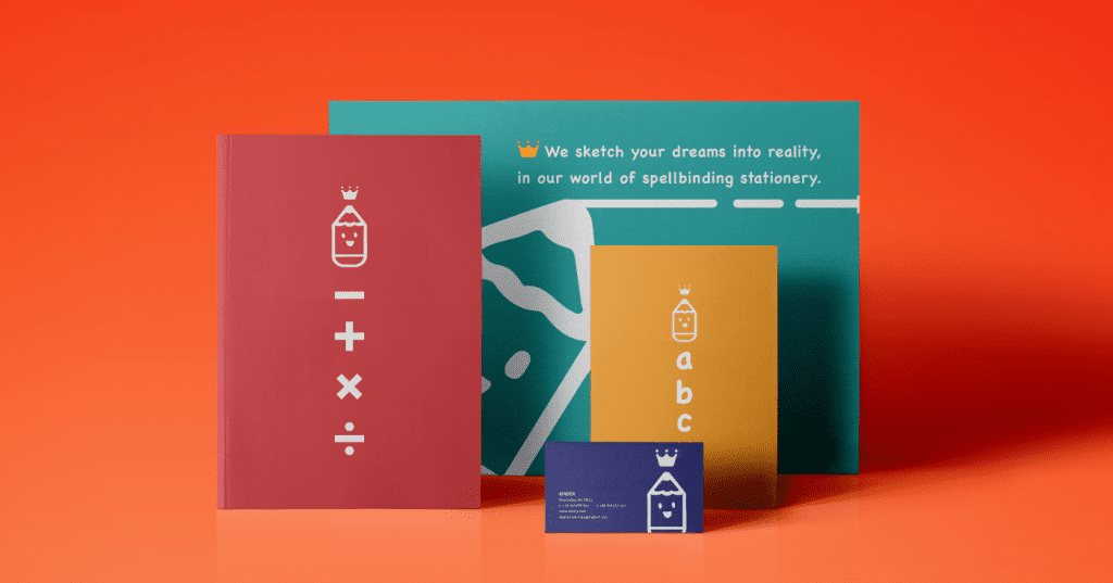
Responding to the changing needs of consumers today is never an easy task, and brands who fail to anticipate the growing demands of their consumers are often the first to fall. As a popular and established stationery brand, Kingdex is well-known amongst the older generation. Established in the 1960s, the range of stationery they proffer continuously expands in response to their customers’ needs.
However, even as their product catalogue ballooned, their visual assets lagged, resulting in inconsistent designs for their product packaging. As such, we knew that we had to strike a delicate balance between adaptability and consistency for their brand system.
By factoring in plans for their future, we crafted a reflexive brand system for Kingdex that could be added to, without compromising on the brand’s consistency. As they progress into the future, with the guidelines in place, the packaging design for their upcoming product ranges will remain faithful to their core identity.
Look around you. Brands that spare little thought and effort to plan for their future are scrambling to ideate new systems on the spot to fix problems that they never anticipated. This often results in flimsy, patchwork solutions that fall through easily, rather than credible, comprehensive solutions that encompass and envelop a brand in her entirety.
As management consultants, we must examine all the fine lines and details in brands that come to us in order to predict their future needs and supplement them as soon as possible. By anticipating change, we can help brands be both sustainable and consistent, far beyond the present.
An unbounded voice for women.
Even in our current day and age, menstruation is still shunned as a taboo topic. Although conversations are opening up regarding periods, we know that we still have a long way to go in fostering a safe and open discussion space for women to openly share about the painful symptoms they have to go through.
Audit
Prior to designing Adore’s new collateral, we wanted to consider their target audience thoroughly. They hoped to reach out to the younger generation of women, who would be the harbingers of our future. In the hopes that they would learn to be fiercely independent and unafraid of speaking their mind regarding periods, we initially conceptualised bold designs.
After all, design is subjective. There are no good or bad designs, and instead depends on the eye of the beholder. When designing for a brand, their customers are the beholders, which is why we design for them, and not the brand itself.
However, the initial designs were critiqued as crude and offensive by retailers who refused to display them in their shops. Countless ideas were thrown out, before we finally decided to take a different design approach to opening safe discussion spaces about this topic. After all, an increase in conversation about periods still helps to destigmatise the notion that menstrual matters must not be discussed in public spaces.
As a rebranding agency who hopes to effect change, we are unafraid of speaking up about topics that are controversial to many yet deserve to be normalised. Our work must have impact and resonate with the hearts of the brand’s audience but must also bring about positive change for a better future.
© 2024 Etereo.