Case Study: Realigning Brand Positioning; Kingdex
It is with great pleasure to be showcasing one of our clients again. And this time, we have Kingdex, a local stationery brand that was established since the late 70s. It may have formed part of your childhood memories from the exercise books, drawing blocks and stationeries that you had used during schooling days in the 80s and 90s. And now Kingdex continues to strive at what she is good at doing best; offering quality and ‘playful’ stationery for today and future generations.
For a brand of more than 4 decades of history, it is worthwhile to note that the management is open to new ideas, and their willingness to recognise and embrace changes. For a start, Kingdex understands the need for a change in their brand strategies as consumer trends have evolved over the years within the populace. With the detailed market research conducted in this re-branding exercise, it has also clearly shown how important it is for Kingdex to adopt changes to their positioning and strategies. This is mainly due to the emergence and adoption of technologies in today youths, and their evolving views on brands and their values. For brands, the failure to recognise such a shift will be detrimental to their brand equity in the long run.
With digitalisation as the driving force for increased accessibility to a spectrum of brands and services online, Kingdex faces tough competitions in this stationery industry. Every brand out there seeks to be heard and many had implemented some form of changes to the way they engage consumers. The only way ahead for Kingdex is to establish a strong and unique position that is not prominent in the local market – a fun and loving brand that is welcomed by both children and adults alike.
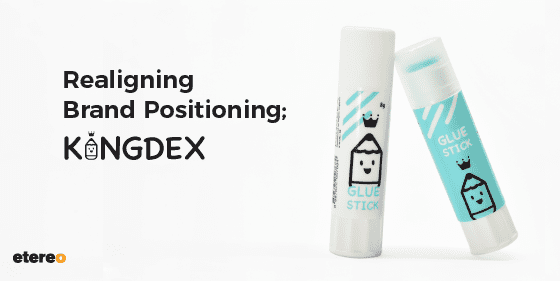
Following this brand repositioning, Kingdex aims to revitalise the existing scene by injecting colours and life into it. To do so, Kingdex has revamped her entire visual expressions to fit this narrative. If you look at the logo, more specifically the letter ‘I’ in “Kingdex”, you will see that it is represented by a cute smiley pencil with a crown on it. The “Pencil” logomark represents her core business while the crown on it suggests a word play on the “King” in Kingdex. The logo is designed to bring out a fun and youthful nature in Kingdex.

Aside from the logo, the new brand colours of Kingdex are filled with vibrancy and energy. Its primary colours comprise of Yellow and Turquoise Blue while the secondary colours are made up of Purple, Pink and Orange. These set of colours represents the message that Kingdex is to bring across – a brand that is filled with sunshine, hope, happiness, positivity, clarity and energy. These gentle colours are eye-catching and pleasing to the eyes at the same time.

To be a successful brand, you need to have a set of strong and impressionable brand assets. This will help your brand to stand out from the competitive market, and that your customers can differentiate you from the chatter. To add, this should be complemented with a well-developed verbal expressions; a personality that can relate and resonate with the target audience and hence, achieving strong brand recall and brand loyalty in the long run.

At Etereo, we help brands realise potentials by going through a detailed walk-through in a rebranding exercise; offering you key insights on your brand, your competitors and the market. This process will also help brands to better understand current consumer behavioural trends, and that realigning market positioning is especially important in this digital era. With companies being able to defray up to 90% of the project costs through the EDG programme by Enterprise Singapore, now might be a good time to relook into your brand positioning. Hence, do feel free to reach us below if you wish to embark on such a rebranding journey with us!