Let’s play a game. An association game, of sorts. How many of the following typefaces and fonts do you recognise?
#1
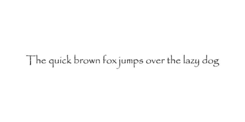
Let me give you a hint – the creator of this typeface wanted to see “what vernacular writing may have looked like if the English language existed 2000 years ago”.
‘Tis a bit difficult to catch, but don’t worry, because answers will be provided later. How about this typeface?
#2
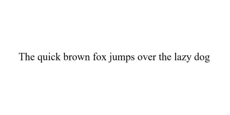
Do you recognise this font, from years of reading newspapers, scholarly articles, and books? Looks like a prim and proper font, doesn’t it? Some might even term it… boring.
#3
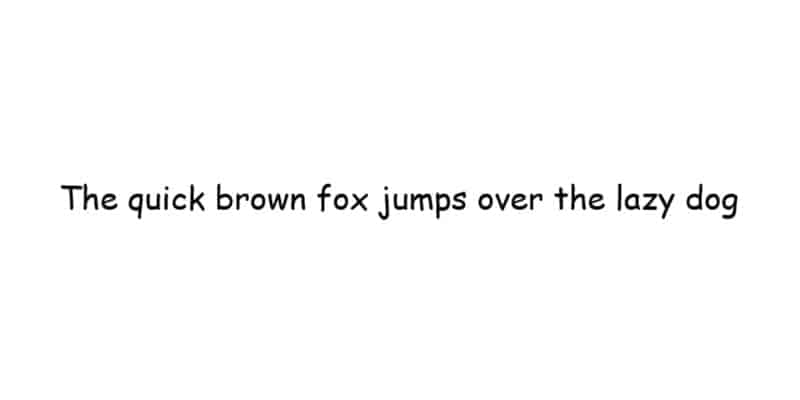
Ah, yes. We can see that you are abruptly thrust into memories of childhood projects… something that smells like craft glue and cheap glitter that refuses to wash off. Yes, we see the grimace of pain on your face.
Well, what about this last one?
#4
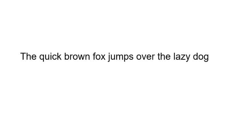
You might not know its name, but you definitely would’ve seen it around somewhere. According to many websites, this is the “most famous font” on the planet.
Now that we’re done looking, how many did you guess correctly?
The Power of Typefaces and Fonts
The point of the association game above was to underscore the power of typefaces and fonts. Believe it or not, when you scrolled past each font, certain emotions would have bubbled up to the forefront of your mind and soul – particularly more so for some fonts as compared to others.
In this two-part case study, we’ll be studying how fonts affect consumer perception of brands or the world. In the first part, we’ll take a look at the four fonts above, and discuss the implications and history behind each typeface.
Let’s work through the typefaces and fonts displayed above, shall we?
1. Papyrus
Designed by Chris Costello, a budding graphic designer, illustrator, and web designer, at the tender age of 23 back in 1983 for the paltry sum of £750, the typeface looks innocuous enough. Yet many have an unslaked thirst of hate for it.
James Cameron’s major blockbuster film, Avatar, the world’s highest-grossing science fiction film. The film grossed more than $2 billion, about 2 million times more than Costello was paid for the typeface. And they used Papyrus for their movie poster.
Here it is, in all its unbidden glory.
Eight years after the release, Saturday Night Live released a skit satirising the usage of Papyrus in Avatar’s logo. You would’ve thought the hate would cool after a near decade. But no, the dislike for Papyrus still goes strong. Multiple blogs proclaiming their intense distaste for the typeface up till today.
Hey, no judgement. When probed about this font out of curiosity, our designer quietly confessed her guilt for liking the font when she was younger. When asked why she felt guilt, she said Papyrus was judged to be “tacky”, but that she liked the font’s unique texture.
2. Times New Roman
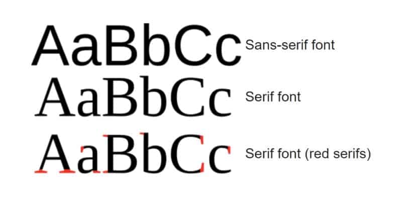
Times New Roman has become one of the most popular typefaces of all time, due to its easy readability. This typeface also stands out from the remainder, simply because it is a Serif typeface, while the others are San-serifs. What’s the difference, you might ask? Don’t worry, we have a lovely diagram here for you to explain the difference between the two.
Serif fonts tend to feel more classic or formal than San-serif fonts. Luxury fashion brands – think Burberry, Yves Saint Laurent, and Balmain – used to use Serif, before unveiling their new logos, in all their San-serif, capitalised glory.
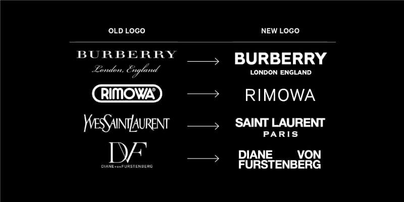
Medium wrote an intriguing article regarding this, highlighting the reasons that have led to the shift from Serif to San-serif.
“This shift intends to communicate a change in the brands’ core image: from the fussiness of old-world luxury, to a fresher and simpler ethos… This is where the sans-serif logotypes come in. By stripping their logos of flourish, brands such as Balmain are purporting to overturn the usual equation between external display and internal quality, which once defined the category.”
Shze Hui Tjoa and Foivos Dousos
All these highlight that the art of choosing a typeface isn’t as straightforward as most business owners tend to think it is. A lot of thought goes into the psychology of the buyer, which translates to the visual strategies that many brands employ.
3. Comic Sans
Easily the most recognisable typeface out of the four above – apart from probably Times New Roman, this typeface has long been the subject of criticism, ridicule, and mockery. In fact, much research has been conducted about Comic Sans and their dislike for it.
Film producer and essayist Errol Morris wrote in August 2012 that the “conscious awareness of Comic Sans promotes – at least among some people – contempt and summary dismissal”. With the help of a professor, he conducted an online experiment and found that Comic Sans, in comparison with five other fonts (Baskerville, Helvetica, Georgia, Trebuchet MS, and Computer Modern), makes readers slightly less likely to believe that a statement they are reading is true.
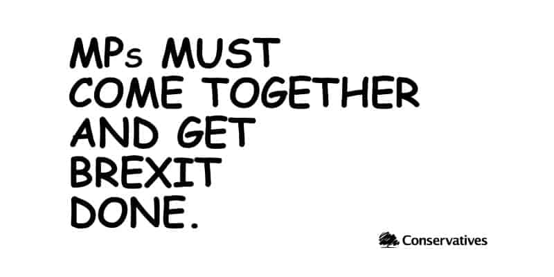
Some notable uses of Comic Sans include Britain’s Conservative Party tweeting an image stating “MPs must come together and get Brexit done” using Comic Sans in October 2019. People were so busy mocking the usage of the typeface that they didn’t realise the typeface’s notoriety was bringing the message to a wider audience.
Still, think that typefaces and fonts are just merely designed for aesthetics?
Returning back to the less educational side of things, when asked for her thoughts on Comic Sans, our designer solemnly said: “If you’re in the creative industry, this is a taboo font that creatives shouldn’t even mention or speak of. It’s always associated with graphic design memes.”
Kind of like Voldemort, don’t you think? Comic Sans, the “He-Who-Must-Not-Be-Named” of the typography world.
4. Helvetica
Now we’ve come to the most famous typeface on the planet, Helvetica. It’s the most commonly used typeface in the world. Appearing in places from governmental agencies, transportation settings, and road signs in Japan and South Korea, to football teams. Scholarly articles and films have been written about the history of this typeface, which was first developed in 1957 by Max Miedinger and Eduard Hoffmann.
We included this typeface in this list because we want to highlight its accessibility of this typeface. Helvetica, alongside several other typefaces, was noted to be good font for people with dyslexia or those who are visually impaired.
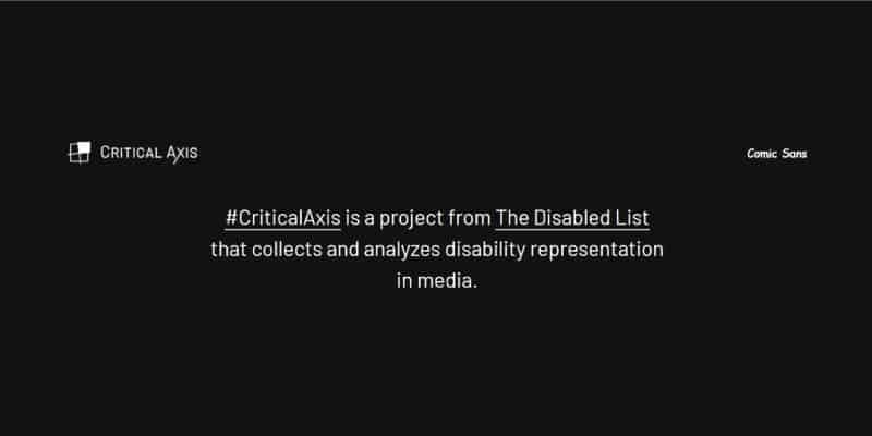
Despite being seen as a “boring” or “generic” typeface alongside Times New Roman, it is one of the most easily-read fonts in the world. Despite the heat that it gets from the wider public, according to Critical Axis, Comic Sans is also the preferred font for many differently-abled people. The typeface is legible because it has bulbous curves, and disproportionate lines, which help people differentiate letters easier when they read.
Critical Axis even has the option to change the typeface to Comic Sans on their website.
Oftentimes, people are so caught up in the heat of the moment of choosing stunning and unique typefaces for their brands that they forget the importance of legibility. When choosing a typeface, it’s important to keep in mind the accessibility and inclusivity that brands should all aim for.
The Importance of Typefaces and Fonts
With all that’s been said and done, we hope that you now understand the importance of typography and fonts for brands. Keep a look out for part two of this case study, where we’ll be studying the psychology of typography in closer detail, and some tips to choose the right typeface and font for your brand.
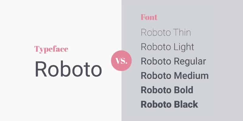
But before we delve even further into more information, we suppose it would be prudent to highlight the difference between typefaces and fonts.
Typeface: A family of fonts. For e.g., the typeface “Roboto” would include the fonts Roboto Thin, Roboto Light, and Roboto Bold.
Font: Variations of typeface in terms of weight, width, and style (For e.g., Roboto Thin is a font, and belongs to the typeface “Roboto”)
Here’s a visual representation of the difference between the two:
Now that’s out of the way, let’s proceed, shall we?
Fonts and Emotions
Imagine if certain brands that you’re familiar with switches their corporate typeface abruptedly. What if Chanel or Dior used Comic Sans for their communication material?
Yeah, we honestly don’t want to think about it either.
The point we’re trying to get at is that different typefaces elicit different feelings in consumers. Your choice of typefaces should depend on said emotions that your brand is trying to elicit in your customers.
In 2006, Wichita State University’s Software Usability Research Laboratory conducted research to find out if different fonts had different emotions and personalities associated with said fonts. More than 500 participants were asked to assign personalities and emotions to each font. The fonts were then organised to the personality factors that they shared most frequently.
Serif – stability, tradition, intellect, and formality
Serifs are denoted by the small lines or strokes that are regularly attached to the end of a larger stoke in a letter or symbol.
They’re the oldest type family that exists, originating from official Greek writings and in the Latin alphabet. Print versions of the Serif were found as early as 1465 when the first movable-type printing presses were first created. They were seen in newspapers, pamphlets, and brochures of that era.
Many different types of Serif fonts exist. But given the age of the Serif typeface, there is little wonder as to why they are associated with the above emotions.
To learn more about the Serif typeface, Typetopia as a pretty great post about it on their social media channels.
Sans-serif – progressive, informal, open, and friendly
Sans-serif fonts came about in the early 19th century but only became much more popular later, during the 20th century, when modernism came into play. They are progressive and emotional, historically popular and cool for posters.
These fonts associate with a break in tradition, giving them the personality of progressiveness and adaptability.
Companies nowadays are breaking away from traditional Serif fonts in favour of Sans-serif fonts – as highlighted in the previous article, in an attempt to appear approachable.
Modern Sans-serif – chic, futuristic and elegant
A sub-family of Sans-serif fonts, we thought this would be good to put in the list given the number of brands that are using these. Modern San-serif fonts are associated with design-focused businesses and brands.
We’ve been seeing a trend toward geometric, modern Sans-serif fonts in recent times, which gives letterforms an open, functional appearance. Geometric modern Sans-serif fonts are associciated with friendlier, and bubblier, as opposed to the traditional chic modern Sans-serif fonts.
Notable brands using modern Sans-serif fonts include Netflix, Chanel, Google, and Airbnb. We use Montserrat, by the way… Just in case you were wondering.
Choosing Typefaces and Fonts
Of course, there are plenty of other typefaces that exist in the world apart from those covered above. More than 500,000 fonts exist in the world, and according to experts, your brand should use no more than 3 in corporate communications. This gives consistency across your brand assets, helping consumers recognise and remember you better.
There are plenty of great ways to choose fonts. Here are a few tips and tricks about making good choices for your brand:
Personality
First, consider the personality that your brand has. We’ve gone through the associated emotions for the different type families above, and understanding your brand personality first would be a great way to chisel out a huge chunk of fonts that wouldn’t be a great fit for your brand.
Your brand collateral, brand strategy, logo, typeface, colours, stationery and applications should be consistent all across the board. Picking a font that is consistent with your brand personality is one of the major factors that you should consider.
Pairing
More might not necessarily mean better, especially when it comes to consistency’s sake. A general rule of thumb is to pick no more than 3 fonts for your brand. The most common pairing often seen used by many brands include the Serif and Sans-serif combination.
Another would be picking fonts based on their contrasting weight. Doing so will ensure a clear distinction between the two that guides readers around your design.
There are plenty of great resources floating around the web regarding font combinations, but one of our personal favourites is this article by Hoefler and Frere-Jones.
Size and Spacing
Not many people pay attention to the size and spacing of their fonts, but this is something that is absolutely imperative to help your readers consume your materials quicker, and more conveniently. Having your consumers squint for information would be terrible. This is why brands have to consider the size of their font, alongside the spacing between each line.
A good rule of thumb would be to have fonts that have:
- high contrast with the background,
- a large font size,
- accessible spacing
This helps consumers read through your web designs easier, than straining their eyes. Here’s a great article about the importance of size and spacing, by Tommy Walker.
Conclusion
We hope that you’ve walked away from this article of ours having learned more about the delicate process of choosing typefaces and fonts for your brand!
Don’t be shy to let us know your thoughts. If you’d like to learn more about picking the right typography for your brand, come chat with us! We’re always open for discussion, and to go through a complimentary, no-obligations, audit of your brand with you.