Helping Your Consumers Identify You Easier in the Crowd with Brand Archetypes: Purpur

In part two of this case study, we looked at how brand personality helped Purpur foster deeper emotional connections with its customers. In part two, we’ll be explaining how we use the brand archetypes to discover her personality so that we can differentiate and identify her from other brands.
One of the methods we use to give some semblance of structure to a brand’s personality is a brand archetype. Let us briefly understand what a brand archetype is.
Brand Archetype
One way to think of brand archetypes is the twelve horoscope signs and how people might think of them as behavioural traits. For example, a person who is a Taurus might be known as being notoriously stubborn and bull-headed.
Similarly, a brand archetype helps to present a brand – its purpose, values, messages, and visuals – as a persona, helping consumers identify and relate better to brands with similar values and personalities as them.
Purpur
In this second part, we’ll be examining how Purpur’s brand archetype anchors and centres her as a brand, both visually and verbally, to help her consumers relate to her better.

The Innocent
As mentioned in the previous case study, a brand’s personality is usually closely related to the personality of the founders. Based on the personality of the founders, we knew almost instinctively that their brand archetype would be Innocent.
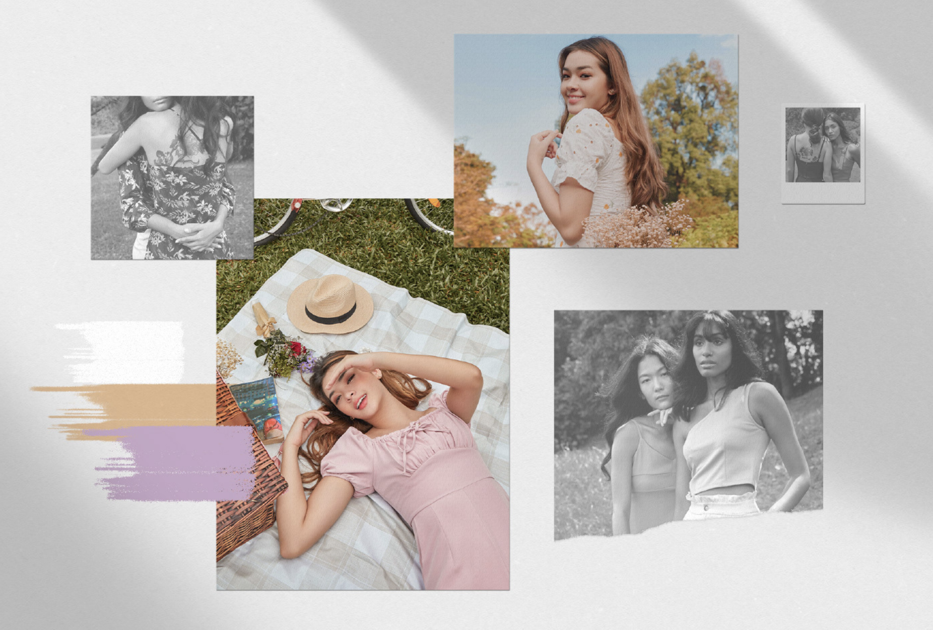
The Innocent archetype has a positive personality with an optimistic outlook in life. Their greatest desire is to see everyone in the world happy. Based on the founders’ values, we chose Purpur’s strongest and truest asset as their representative – happiness. She wants to give off happiness to the people around her, motivating them to grow from girl to woman and have the full experience that comes with it. Her designs are simplistic and comfortable because she wants her customers to be incandescently happy in Purpur, doing things that they enjoy.
When we identify a brand’s archetype, we know that there are certain expectations of them and the archetype that they stem from. For example, Purpur would be warm, rather than chic, and be receptive and welcoming of interactions with their ladies, rather than dominant and instructive.
Brand Colours

For Purpur’s brand colours, they requested to keep their corporate colour purple. However, to reinforce the general feeling of the Innocent, we had to follow the criteria of softer colours that do not clash and are comforting to the eye. The colour must be popular and trendy, yet muted and gentle.
To fit their personality, we chose a softer, muted shade of purple, one that is understated yet elegant. Purpur has never been a loud brand, but always exudes confidence and elegance in her own subtle ways. To add a secondary colour to support our primary shade, we chose yellow. For many, yellow is bright and cheerful and is evocative of happiness for many, hence why we chose it to add a pop of colour and merriment to their palette.
Overall, their new brand colour palette is aesthetically pleasing, comforting, and soothing to the eye.
Purpur’s service staff were also coached on the tone of voice to take, and the words to use when interacting with their ladies as befitting a brand with an Innocent archetype.
With her ladies’ best interests in mind – be it getting the right size, colour, or design, Purpur would want their ladies to be happy. Hence, they will strive to be warm and sincere when communicating with them.
This has also been translated into all her digital touchpoints. Interactive content is consistently planned to get the Purpur community to participate and engage with Purpur so that they can hear their voices. What colours to launch next, what outfits they’re looking forward to; be it denim shorts, skirts, or cropped tops, Purpur wants to involve her consumers in the planning process to better respond to their wants.
Packaging Design
With their packaging design, going the extra mile to make their ladies feel exceptionally welcome and happy was key. The Innocent wants to make those around them happy, and if it means going the extra mile, then the extra mile is a journey worth taking.
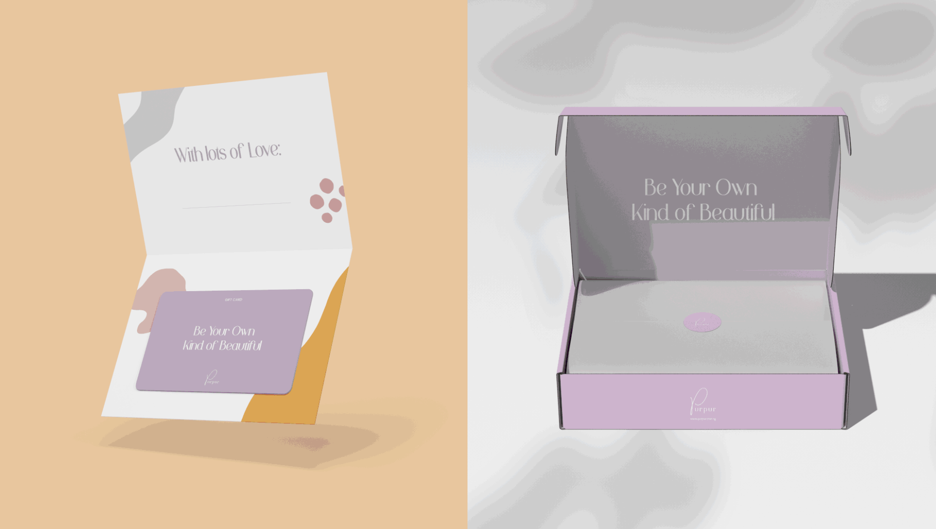
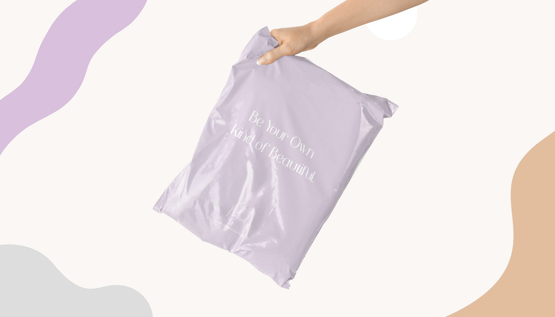
Hence, the key to Purpur’s packaging design is personalisation. To let the personally worded messages from Purpur stand out, we kept the design elements to a minimum, using organic shapes and colour blocking to allow the messages to shine.
Paying attention to the little details of their brand experience would help consumers remember and return to Purpur easier. After all, no two brands offer the same experience, and it’s the little things in life that go the long way in helping your consumers remember your brand.
By designing personalised poly mailer bags with a personal note from the founders, they want their customers to feel happy when receiving the parcel and to let the customers know that Purpur is happy when they are. It’s a mutual relationship that feeds off of each other’s happiness, spreading waves of joy.

Forcing a Brand into a Mould… or Giving Her a Guide?
Anchoring and centring a brand around one archetype is a deceptively simple task. Brands who want a little bit of each archetype inevitably end up confusing themselves – and their consumers – in the long run. Hence, a primary archetype or at most a secondary archetype is strongly recommended for each brand.
But then, this gives rise to the question – would brands fall into a mould and be one and the same as the rest of the brands with the same archetype?
The short answer is no. For example, both Channel NewsAsia and Google fall under the archetype of the Sage. However, the key messaging strategies and visual cues for each brand are completely and wholly different.
These archetypes serve as a solid foundation for brands to build their personality, with subtle nuances and shades to their personality. Think of brands as living, breathing, entity, capable of reacting and responding to the situations around them like any normal person would.
This is how brand archetypes affect the choices and instructions for each brand. They serve as an underlying foundation that will affect the brand system and her visual aspects, yet not dominate the brand completely and take away from her underlying value.
Is your brand looking to differentiate itself from its competitors by anchoring itself around a brand archetype to grow into?
Due to the pandemic, Enterprise Singapore has increased the cost defrayed for each branding project from 70% to 80%. Now would be a good time to seize the chance and look into ensuring that you have a brand archetype so that your consumers can remember you better.
We would love to see how we can help to identify your brand’s archetype and give her a singular, formidable direction to grow into. For a complimentary, no-obligations, brand audit, contact us today.