Brand Identity, Brand Applications, In-Store Art Direction
Brewing the perfect cafe culture
It’s no secret that Singapore has a vibrant and unique coffee culture. Compounded with the fact that catching with friends over coffee or kopi is a favourite pastime and the growing demand for memorable customer experiences among younger generations, it is no wonder that cafe establishments has increased tremendously over the years. The question is, how do we make one such cafe stand out from the rest?
The passionate founders of Nickel SG asked Etereo to craft a visual identity that fits their vision and help them foster a cozy culture in their space, which opened in late 2023, right in our neighbourhood.
Purpose:
Bringing authentic french baking to Singapore
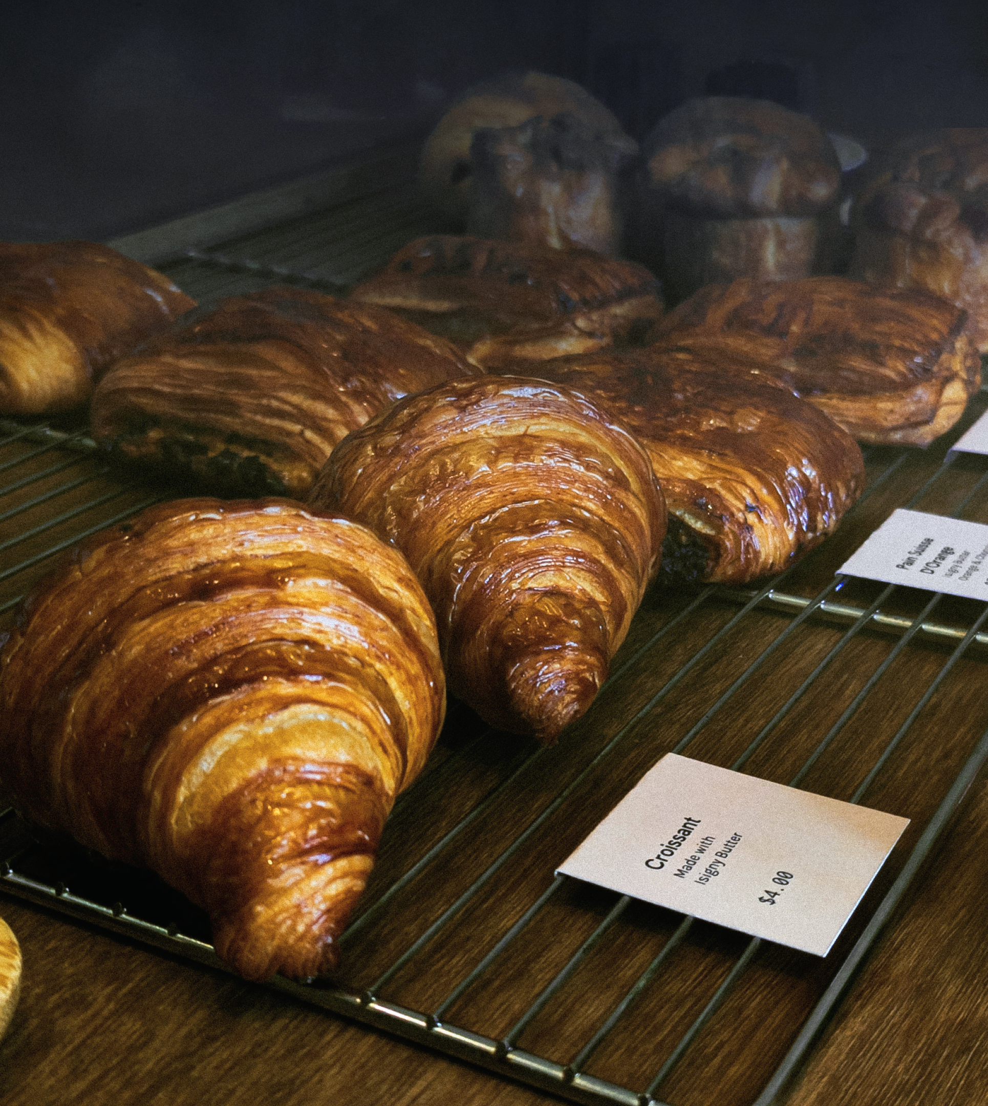
Nickel Cafe is the reincarnation of the beloved local bakery Lee’s Confectionary. Baker-owner Lee, who trained in Ferrandi Paris, wants to create a warm, intimate space where people can relax and enjoy authentic French baked goods and good coffee.
Their name is a nod to the French phrase “C’est Nickel”, which colloquially means “it’s perfect” or “it’s great”, an expression often used to describe something that is done well, in excellent condition, or just right. With an emphasis on quality, both in their artisanal food and their service, this speaks to the unparallelled experience they strive to deliver for every customer.
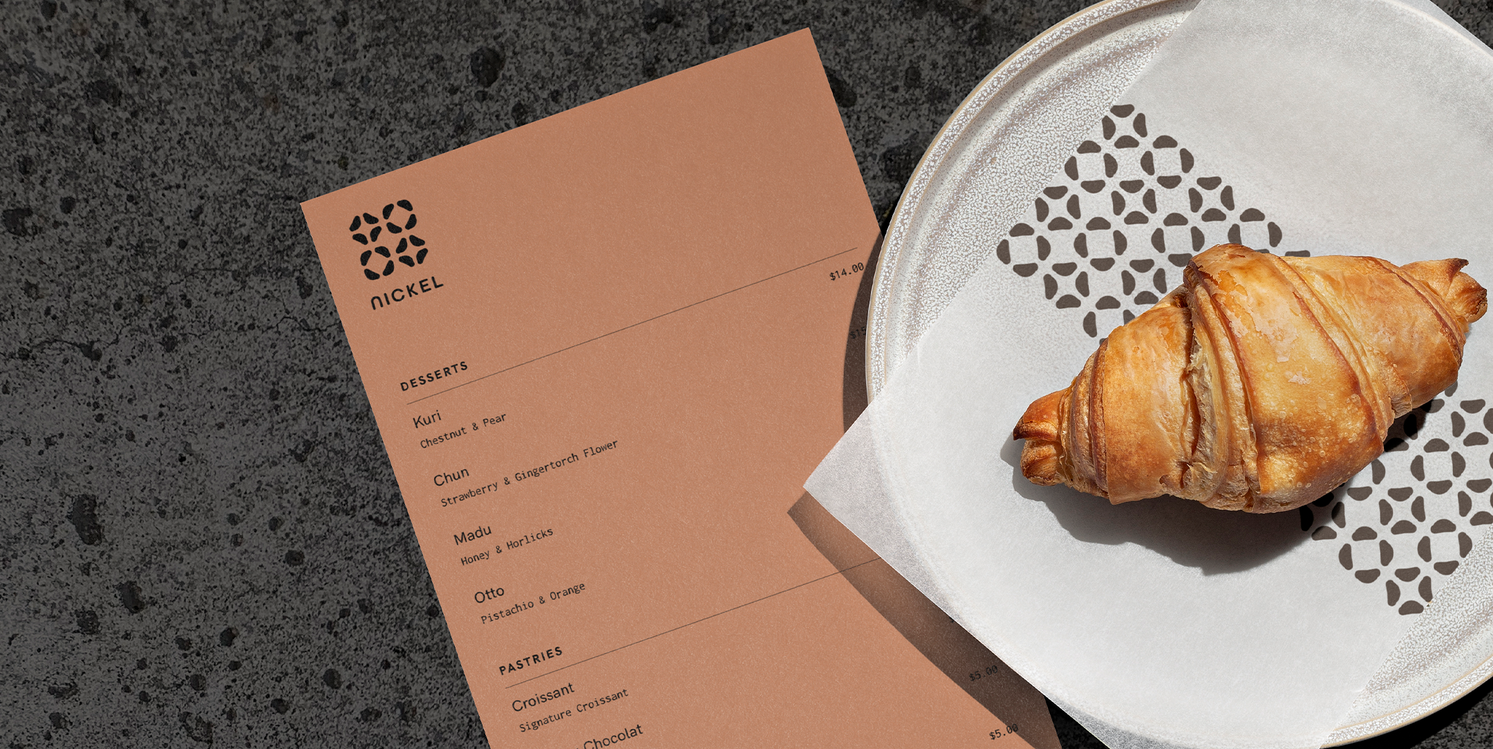
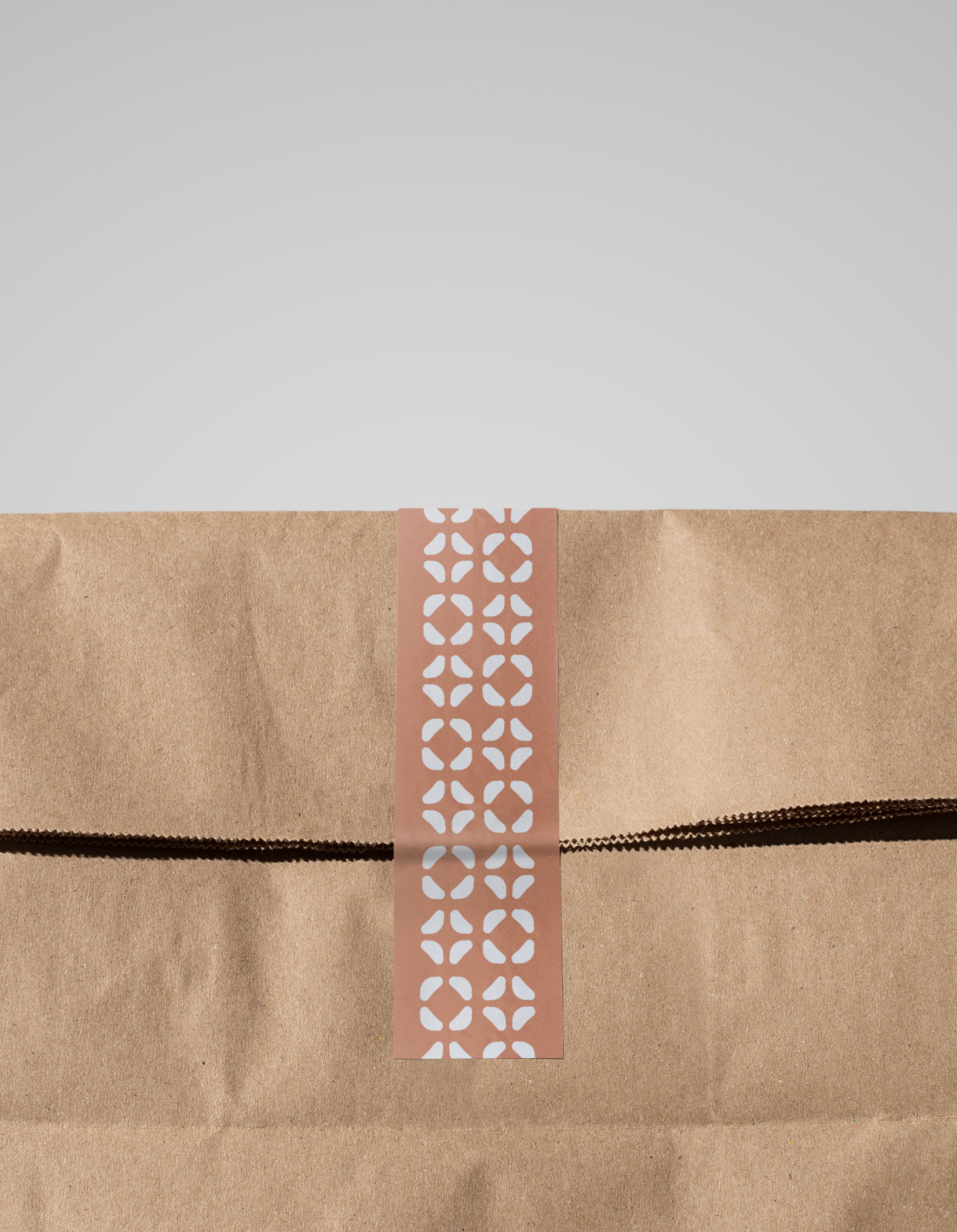
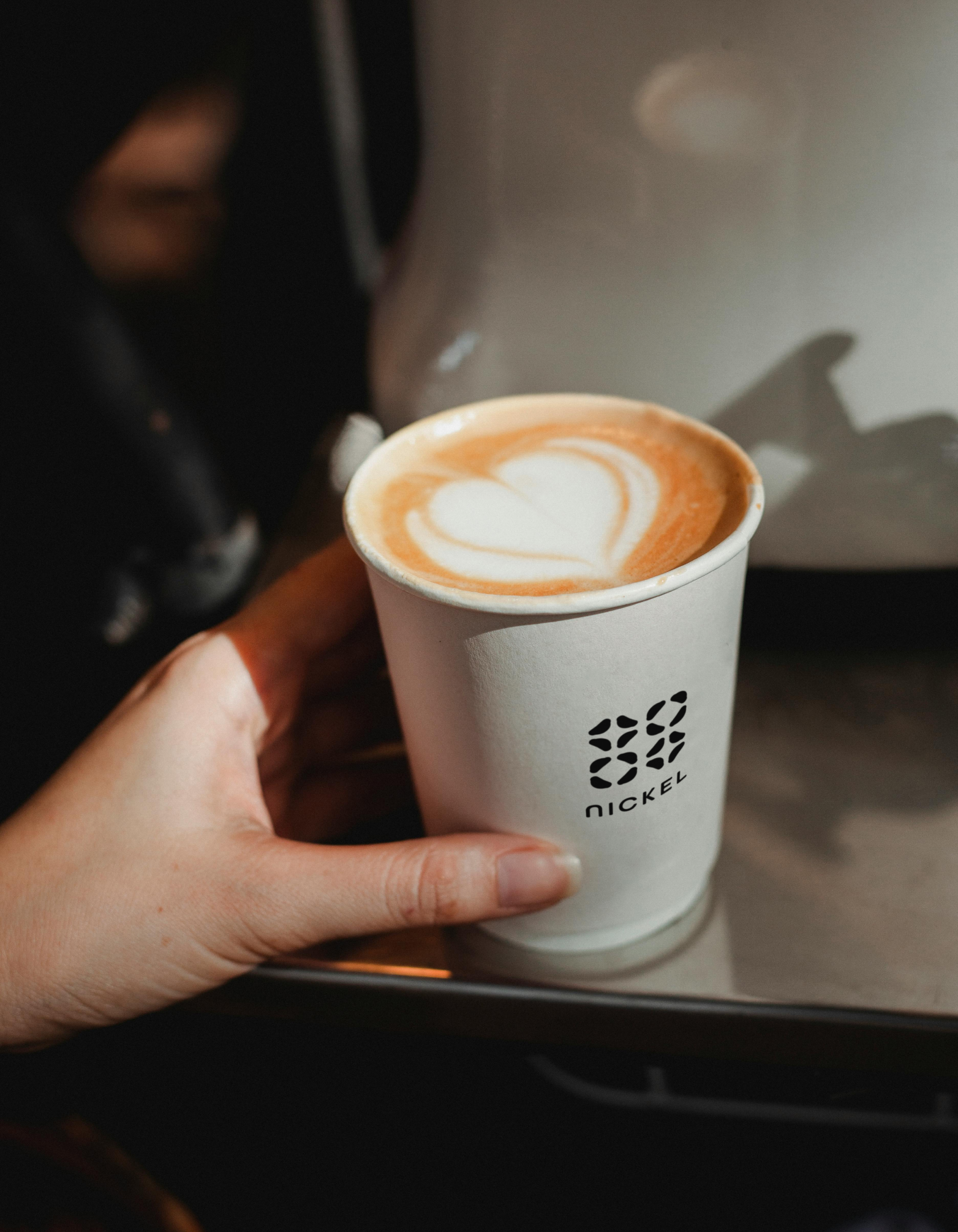
Their logo is a combination mark showing their brand name and a pattern made from an arrangement of shapes which can be interpreted as croissants or coffee beans, showing the synergy between the pastry chef and the coffee connoisseur. Although they serve a wide variety of pastries now, lately adding cakes and plated desserts, viennoisseries and coffee were what they started with.
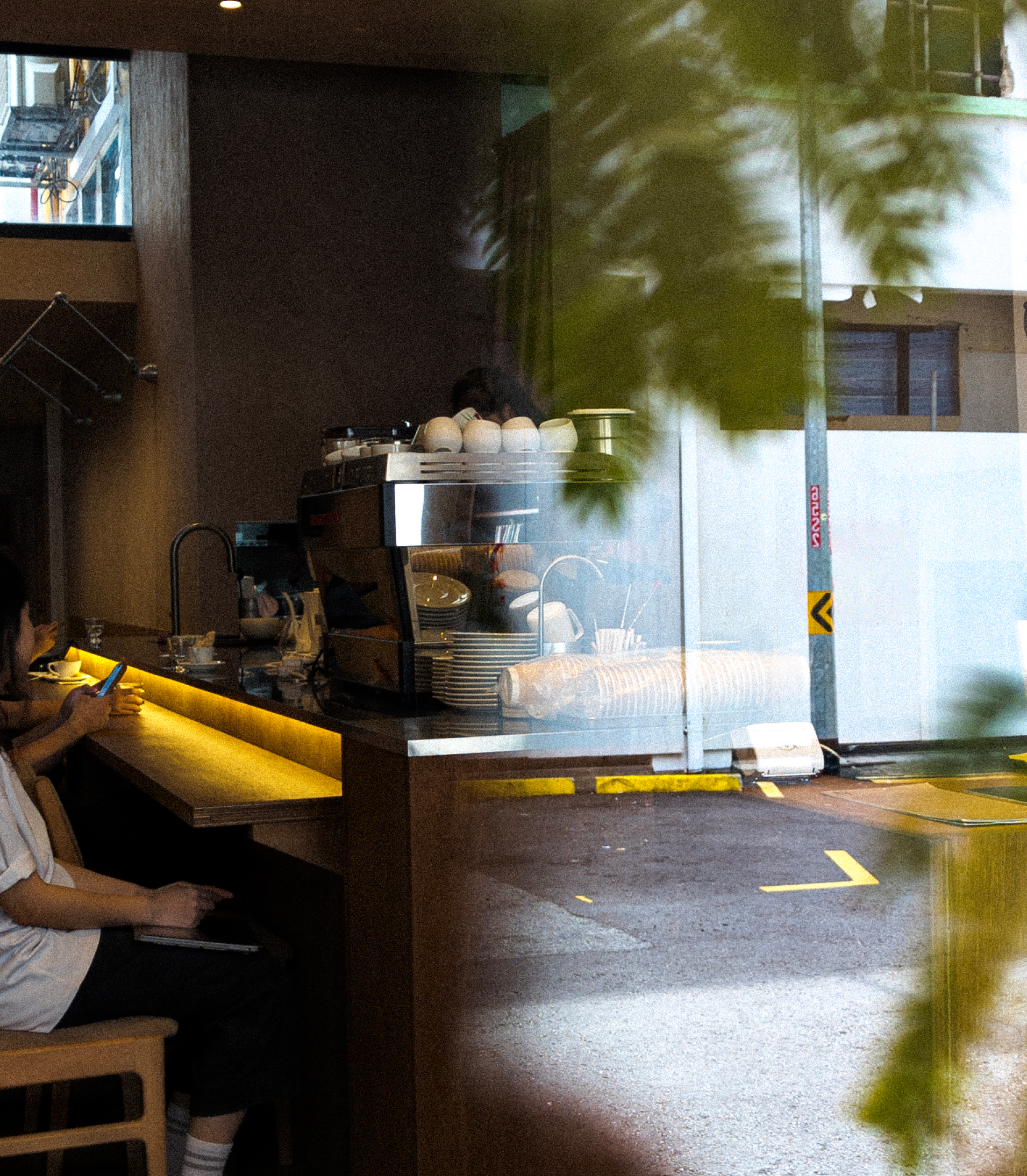
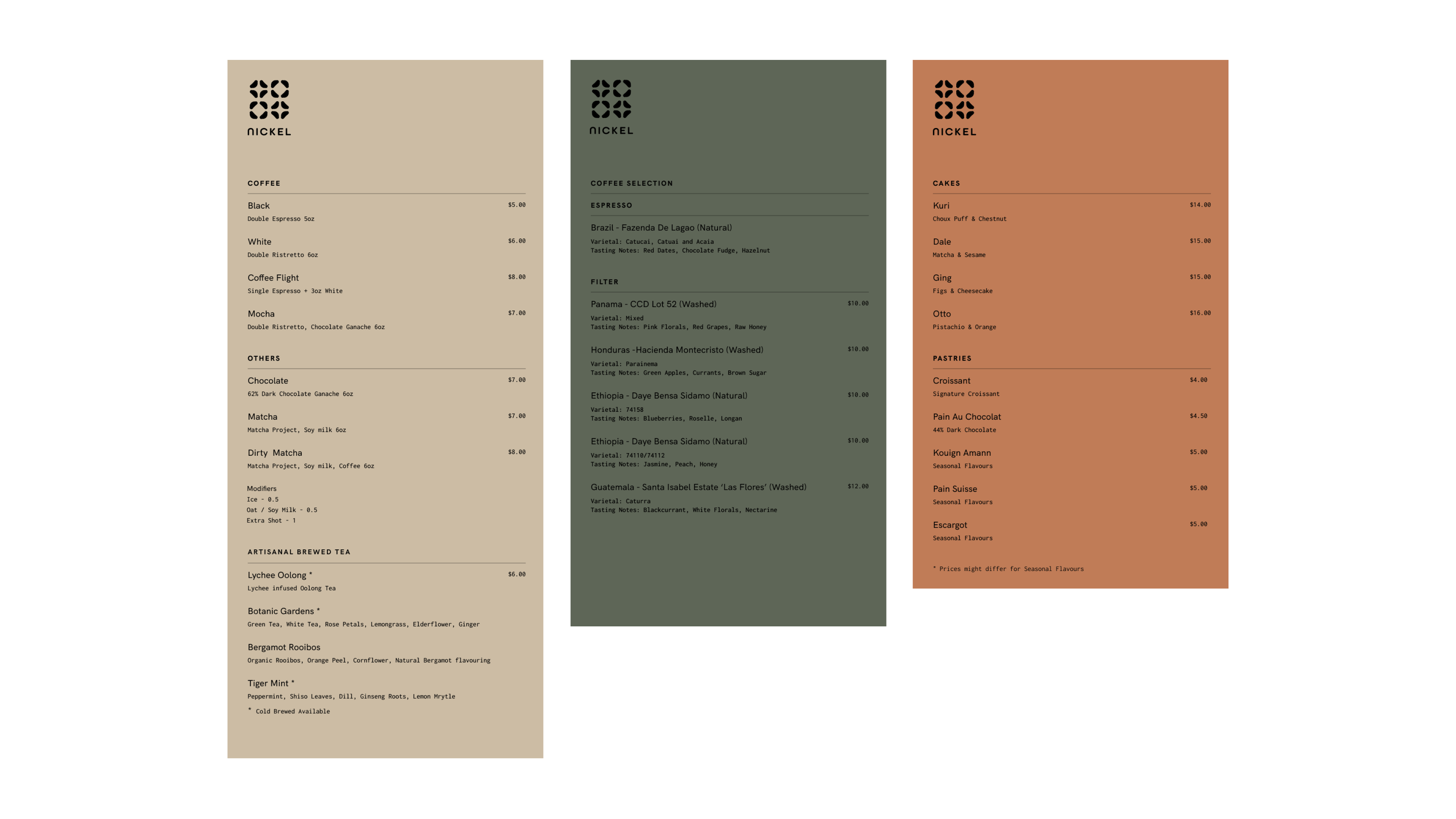
To create their modern yet relaxing atmosphere, they went with Japanese industrial minimalism and an earthy colour scheme for their interior. As their pastry and coffee selection grew, we made a set of menus to match – menus in rustic, earthy colours that evoke materials like wood and cement.
A few months on, Nickel enjoys a steady traffic of cafegoers clamouring for their latest tasty creations and enjoying the space, where they will catch up with their friends or get some work done. This activity is exactly what the founders envisioned. We are happy that they managed to foster such a thriving community in such a short span of time and that we were able to be a part of fulfilling their vision.