Singapore’s leading ship chandler, Moby Dick Supplies, has been established in the marine industry for over 30 years but their brand assets have never been updated before we came along to do them justice. By combining the founder’s philosophy and a suitably themed creative direction, we crafted a fresh visual identity with matching assets that reflect the essence and core value of their brand.
Vision:
To be the preferred ship chandelling partner in Singapore that guarantees satisfaction upon reaching our docks
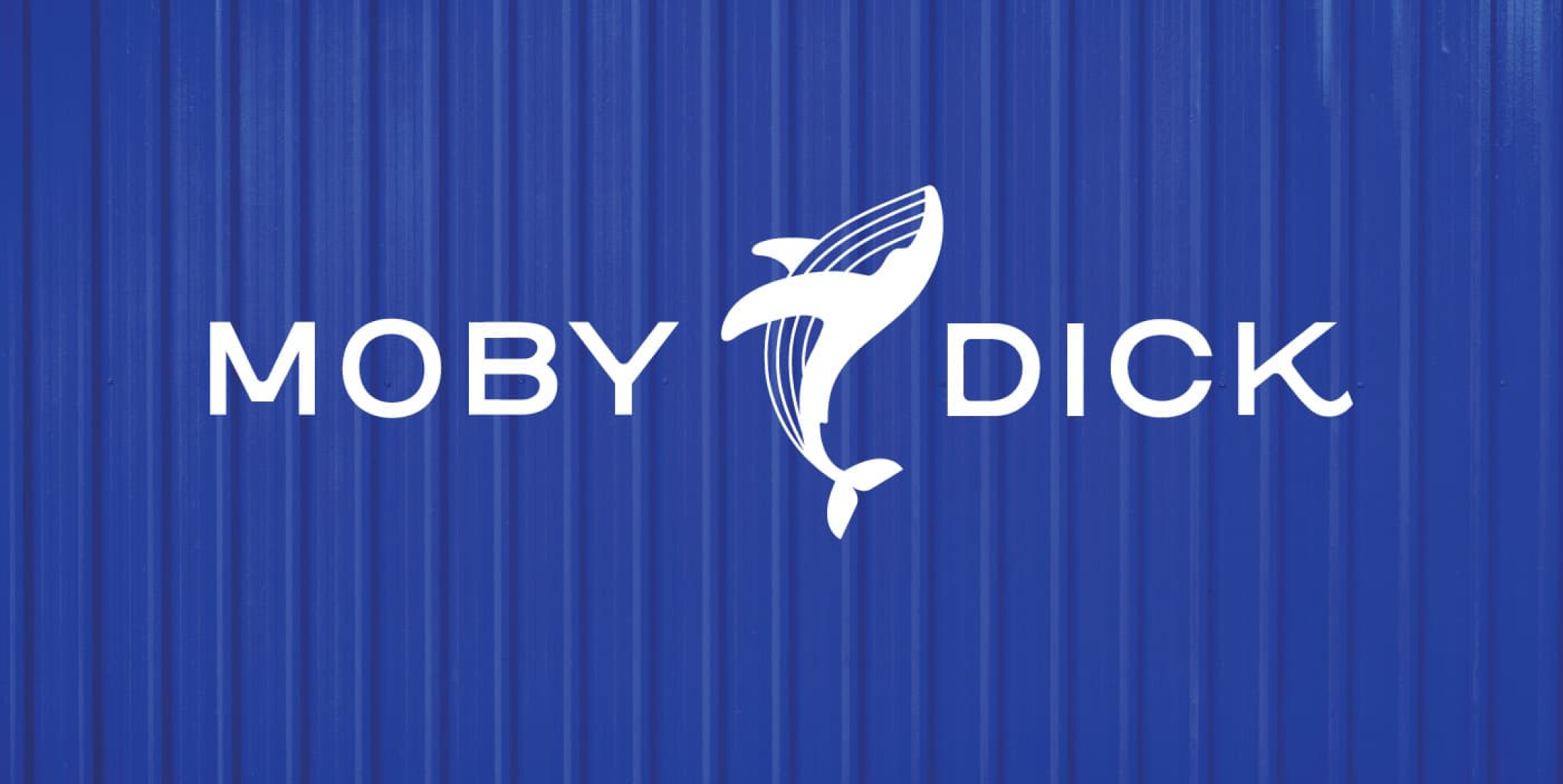
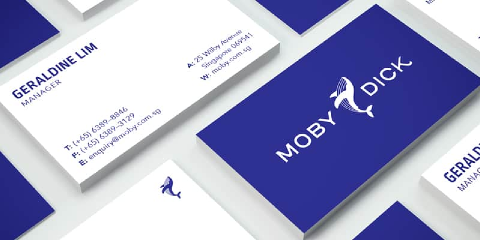
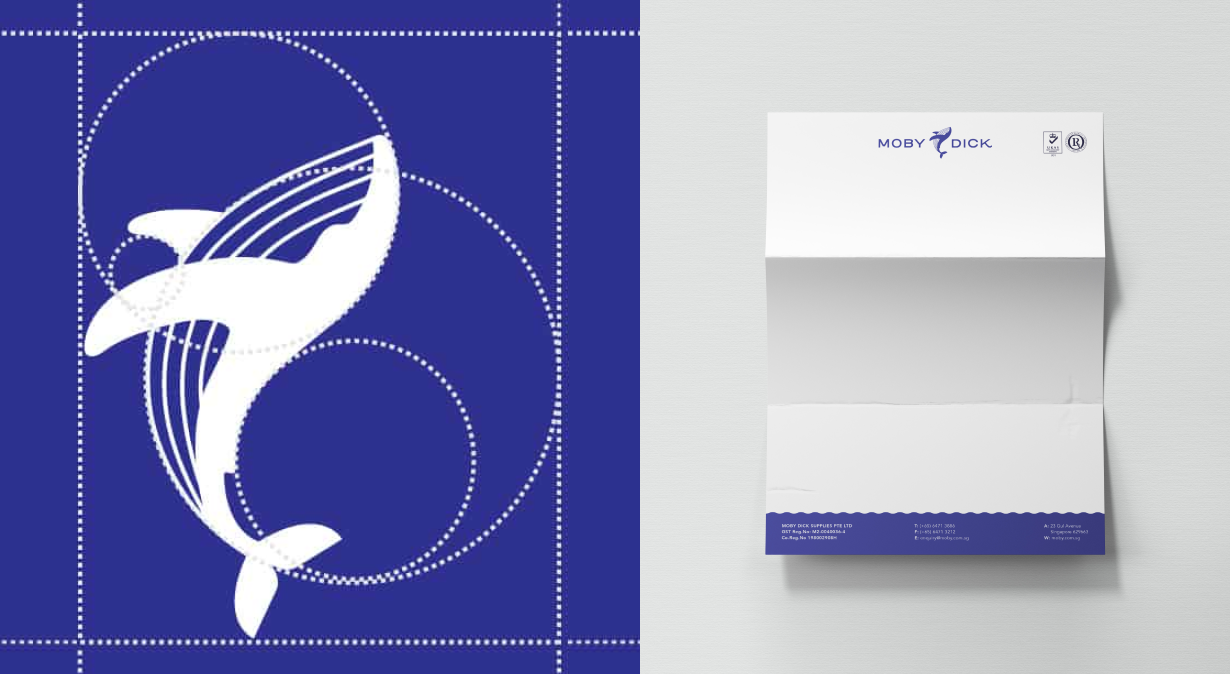
Moby Dick Supplies’ logo is a combination of a wordmark and iconography. To give it fluidity, we used circles and the golden ratio to structure the icon and applied the curvature to soften the edges of the wordmark.
The chosen whale is the humpback whale, a species known to be gentle and calm, yet indomitable and free, which is perfect for Moby Dick Supplies. Their unabating passion to continuously improve as ship chandlers is incorporated into the whale’s graceful dive as it breaches the surface of the sea.
Blue, of course, is one of Moby Dick’s primary colours. To reflect the dynamism and vibrancy of their work culture, we selected a rich, bright tone and complemented it with pure white, black and light grey.
Gone are the days when the visual identities for B2B companies are strait-laced and boring. In our current age, aesthetics plays a huge part in making an impression on potential clients. With the conclusion of this rebranding project, we’ve reinforced Moby Dick’s Supplies’ existing ethics with a visual identity that echoes and resonates with their values.