Brand Identity, Brand Applications, Web Design, Profile Kit
Marketing
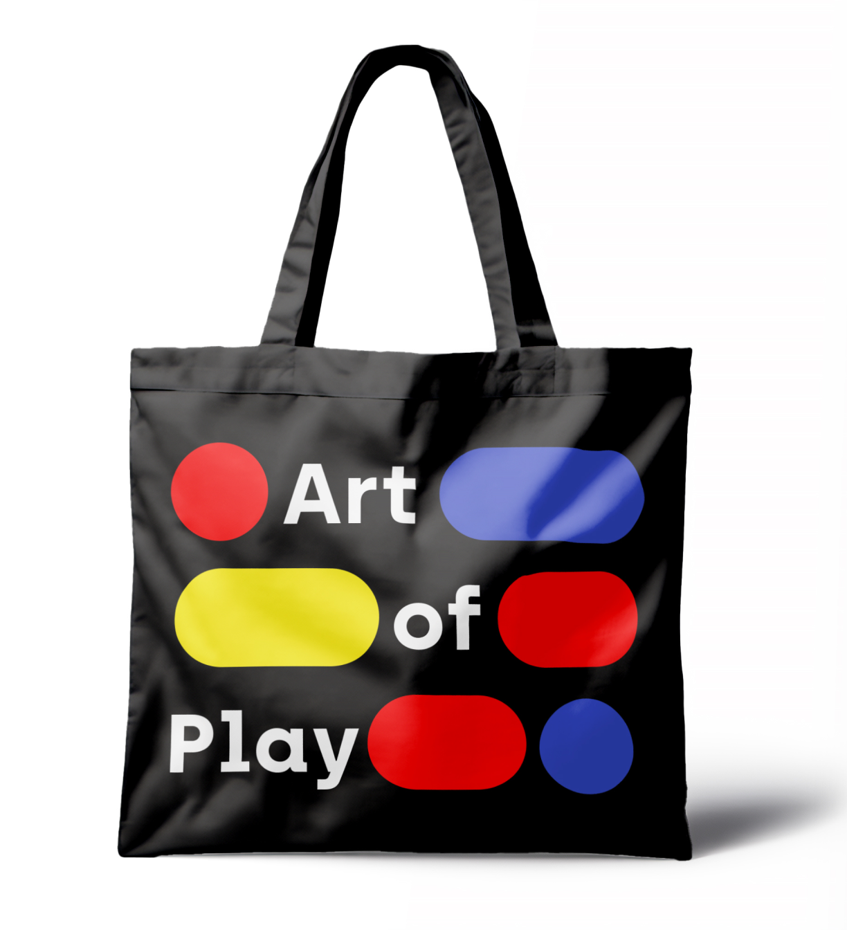
Community Building, Social Media Marketing, Collaborative Marketing
Fostering a vibrant and playful community
As innovative leaders in the playground industry shaping landscapes in Singapore and beyond, Playpoint needed a fresh visual identity to strengthen their positioning and work with their future goals. On their 20th anniversary, they decided that it was time for a change. They partnered with Etereo to embark on this exciting new phase as a brand, one where there is room for their growing ambitions and where they are ready for international expansion. Today, Playpoint has offices in 5 cities and their award-winning works can be found all over Asia and beyond.
Purpose:
Delivering ingenious playground designs that connect people through play.
Playpoint does not merely build and maintain playgrounds; they constantly innovate and explore the possibilities of play, fun and leisure to improve the world we live in. Besides making incredible playgrounds for children, they promote healthy and active lifestyles by building more recreational spaces, outdoor fitness areas and street furniture in cities. Based on extensive research and analysis on the organisation and the landscape architecture industry in the context of children’s development, we crafted a strategy that defined the intended perception of Playpoint consistently through their personality, voice and story.
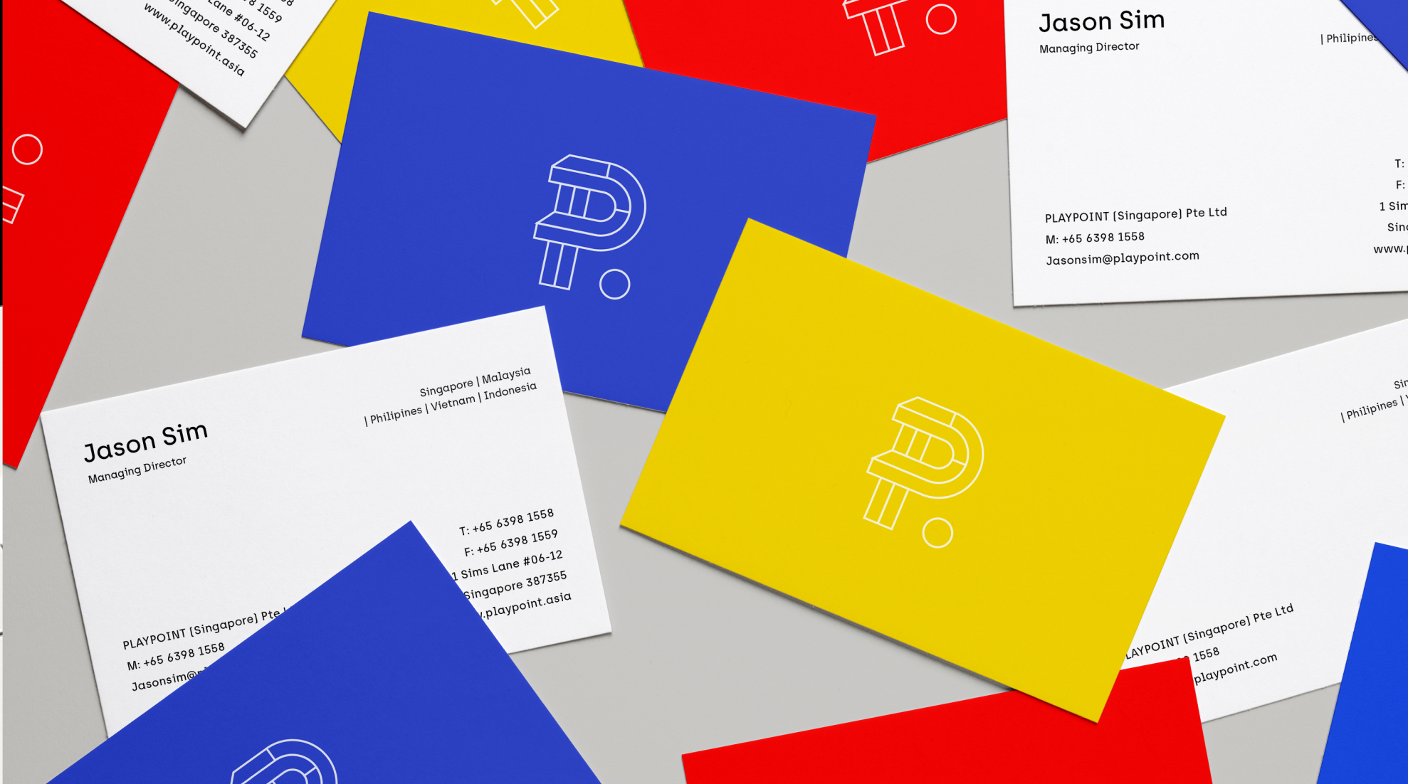
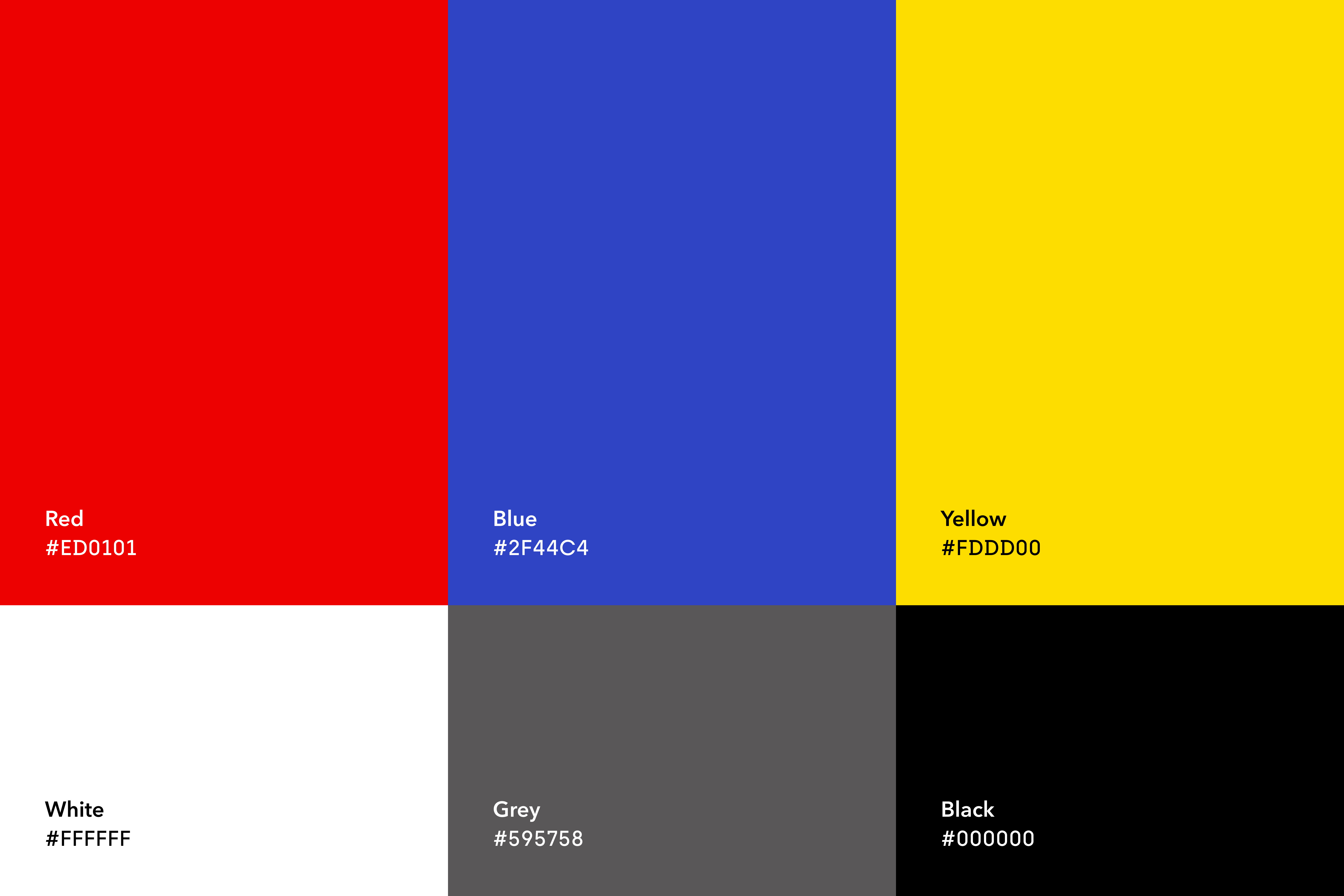
Inspired by Playpoint’s focus on the design thinking process and raising the standards of recreational spaces today, fun and creative design thinking elements were employed in the collateral designs, setting a new paradigm in the mostly conservative playground building industry. Their logo, the letter “P” made up of building blocks, is premised on the idea that all great works of architecture were formed from building blocks from basic principles. It is also a reference to the one of the first toys most children would play with as they learn to identify shapes. The logo is black and white, and it can be applied on a colour palette of the primary colours red, blue and yellow (as well as a gentle light silver-grey). Primary colours are chosen for its suitability and appeal to young children during a time they should be constantly stimulated. Colours plays an important role in children’s development as well as brand identification.
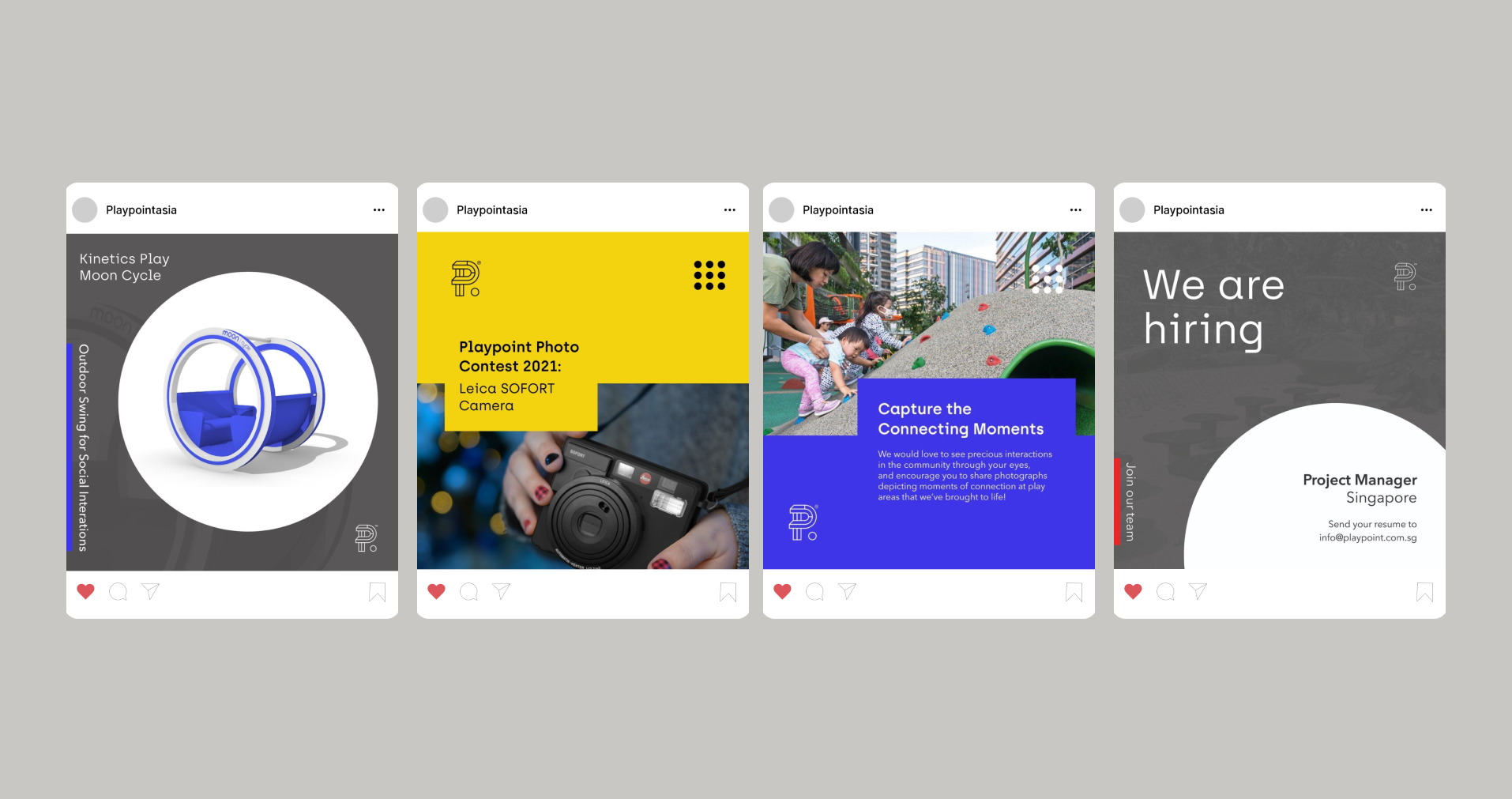
Subsequently, Playpoint is ready to engage with audiences on- and off- line, letting people know about their latest projects and inviting communities to join them on various adventures. Through these channels, they achieve their goals of sparking young imaginations, spreading joy and giving people the opportunity to bond with their loved ones and get closer to their community.